Website
User testing
We did some user testing, still doing more.
Results: People need to know what score is upfront, also that were talking explicitly about business mentoring. Our app/bio concept was confused a lot with profiles... users leaned toward creating a profile. Possible qualifier points could be interactive quizzes or filters to match interests and expertises. Initiation, like things popping up, was recommended.
Site Features/Characteristics
I looked at highly rated websites in 2018 for user satisfaction and user friendliness. I will post a picture of my scrap work as well as screen shots of features I particularly liked working with. I looked at random websites as well as mentor-specific websites.
General Site Features:


-I like Mikiya.Robayashi's menu because it doesn't take up space on the web page, and you have to click on it to make it show.

-Micro Mentor had a community Q&A section. I thought that was a good idea. You could also search to see if your question was already answered, its kind of like an open forum.
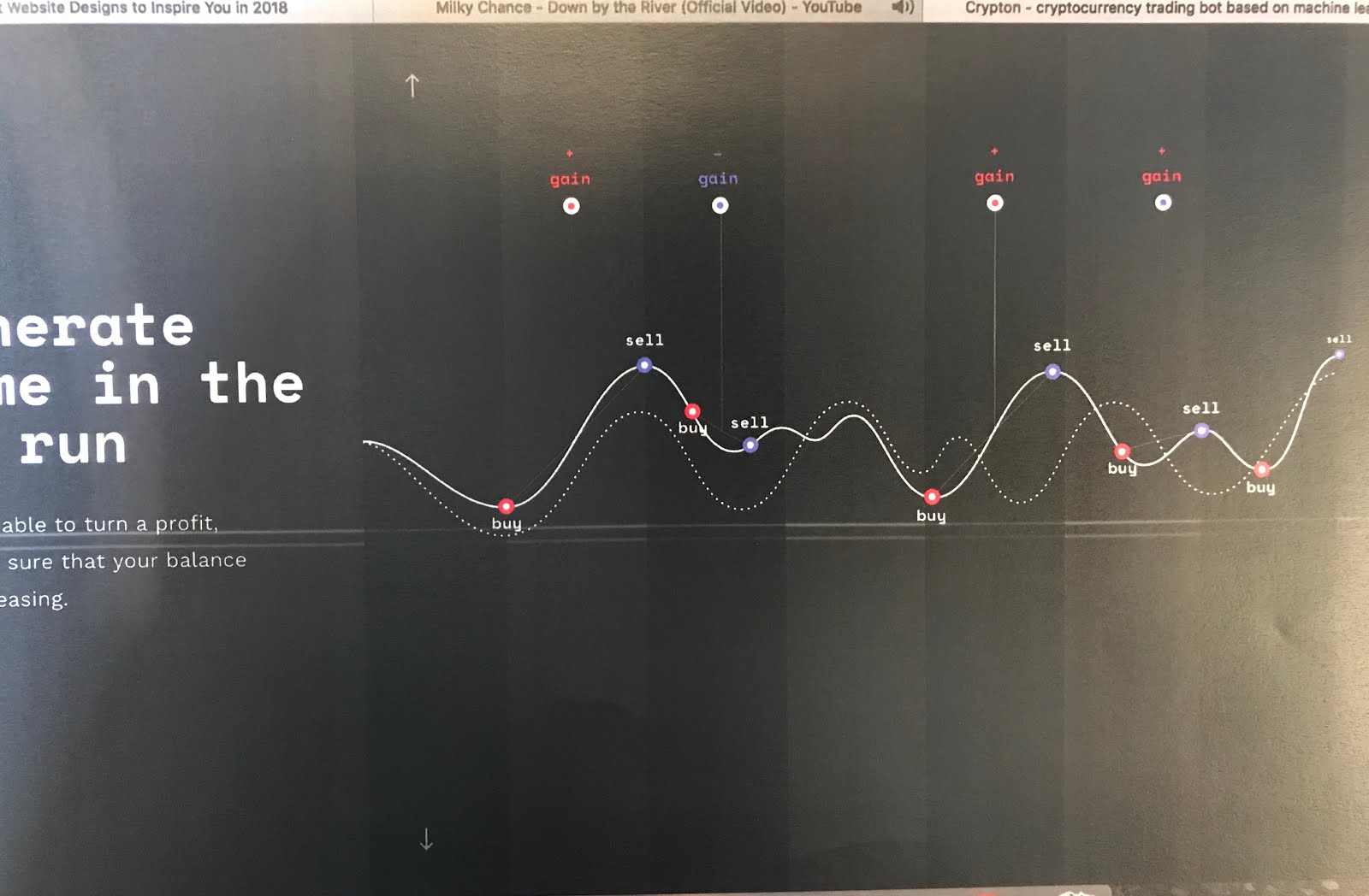
- This site, Crypto.Trading was super interactive. As you scrolled, more data would pop up. And it was extremely easy to understand because the information was exposed to you at the same speed you were scrolling.

- At the end, you came to all their contact information. Working on a mac it was incredible because clicking on "Mail me" automatically prompted a new email to them.
-There was also a "Call me," and that basically called them directly off my laptop as well. The mobil website was very similar and worked just as well, surprisingly.

- I also liked how they had a couple hovering bubbles around different, but specific parts of the picture that would show informational text when you hovered over the bubble.
-At the bottom left and right of the screen were the page turning buttons I guess you could call them. They were really neat because they didn't seem like buttons whatsoever but if you clicked them you would be moved horizontally to the next page.
-Not pictured is their menu. I thought it was really special because when you clicked "menu" at the top of the page, the menu dominated the screen. It covered everything up and all you could see was the menu options listed horizontally. Dragging the mouse left or right would show more options in the direction you drag the mouse.
** I think sites that are interactively inclined are swell because it keeps the user interested and entertained during their user experience. I see why these websites were on a "top rated" list.
Other Mentor Site Features:
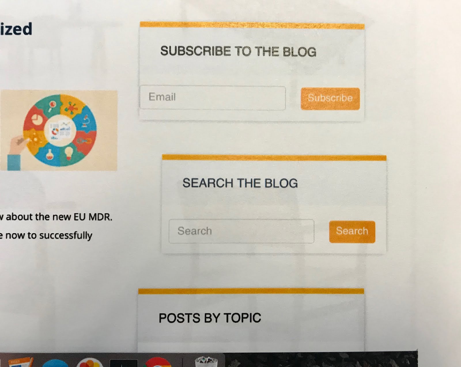
 - ETQ had nice boxes in the empty space of their site that offered the user a chance to subscribe or search the blog in an organized way.

- This is Micromentor again and I thought they had a pretty succinct way of organizing their mentors and mentees. They had the click to color in the button style buttons to select weather you wanted to find a mentor or be a mentor.... with asmal description underneath each.

- Micromentor also had a really great option of signing up with an already established social media account. I 100% think that we should do that if we can for our website. That is such a shortcut and an easy way to connect anyone right to our social media!
 - These are some questions that were part of the application process for SCORE that I thought were worth looking at.
- I also liked how they had the response part of their questions like... pre-set. You just selected an option rather than actually having to type one.

- This is from micromentor too, a button like this might be useful for us.


Content
- We established 6 pieces of content that needed addressed. I think that these two bodies of text hit them all. The 6 are: mentors, score, business development, mentees, having a business and maybe being score ready. The Mentee one could be broke up into 3 paragraphs with more explanatory headings before each paragraph.... if we want. I was trying to be succinct, but if need be I can add to this. Compared to other mentor websites it is a good introduction.... it focuses less on what we are which is oaky I think because anyone participating is going to have a good idea anyway. It is helpful reading for any potential user. Maybe I need to make a different approach, though...

Edits to content...


Site Fabrication
Name: ementorcenter.com
- We've decided on using BlueHost to host our site
- We're also using wordpress for their templates and easy editing
Templates.... We spent time shopping templates and finally settled on one from theme-forest. It is called Mentor-- personal development coaching. We're having extensive trouble with uploading the template successfully to our site. It's not all there... so we're stuck with building from scratch if we keep working now. Nancy is in touch with the support team.
******* We have the site up and its pretty legit. Today I'm spending time editing the layout as well as inserting content. Doing some light copy work as well. Here are some rough drafts....

Blogger-- its been a while! We're further developing the site and I have come to the conclusion that we are trying to create a site which will operate similarly to a dating site in that members will be automatically matched by common interests/expertise! Here are some plugins I'm exploring...
1. pHpDolphin- Social Media Platform, communication driven
2. Buddy press, profile building & user display
3. Pitch a match, video chatting
4. Group-o-matic... buddy press extension, ACTUALLY HAS A MATCHING FEATURE! Here's a little bit about it:
- It does not require any additional database tables, nor does it modify any of the existing tables.
- The decision to match a member to a group can be based on their responses to extended profile fields.
- Match groups using their Name, Slug, or ID
- Match groups based on member response data using a flexible macro.
- Add members to a specific group based on a Yes/No type of field.
- Toggle automatic joining on/off without losing your settings.
So.... I'm probably on hour 7 in the last... 10-14 days of researching plugins. I've come to find that there really aren't any plugins out there that do exactly what we're looking for. I've browsed myself and even read similar conclusions on forums such as Redditt. Good opportunity to create one haha, the need is there! I did come across what may be our best bet when meeting with Neil... and that is BuddyPress. Tonight 11/13 6:00pm I discovered an extension for this plug in which may be our closest option. However theyre both paid. But it would work a little like this: We would need to create groups with in BuddyPress and then members with interests included in the created groups will be added to those groups. In other words, it would be a general matching process like maybe Marketing, Non-Profit, Financing, and groups like that. Its one step closer but will still require a lot of customization and leg work on... me I guess! So I'll pause here for the night and dive back in after I check out what our budget may/may not allow!
As of right now, in order for buddy press to work in our favor I know we will need to upgrade to a paid version of an existing plugin we have: Profile Builder. Next we'll have to pay for buddypress (70$/year) and the extension is free unless we want the upgraded version.Or, here's one way this BP and extension could work.... We make the available interests and expertise's the groups. That way when a user lists them, they'll be added to that group and be able to see other people with that same data. I dunno. Just brain storming.
Comments
Post a Comment